
Bite #6 Tips & Tricks: Museum Labels
To read a label, or not to read a label? That is the question . . .
“Do you read labels?”
It’s a question that is commonly asked amongst museum visitors and staff; and I’ll tell you my biggest secret: I don’t read labels . . .at least not right away.
I’m a discovery visitor (yes, in the world of visitor research, there are different categories of visitors, but that’s for a different article). Personally, I like to just go in curious, and form my own opinions about the objects first, and then delving in closer to the read the labels on the wall.
But first, we need to start at the beginning . . . what is a label anyways?
A label is a simplified term for the word didactic which is the professional phrase. According to the Scottsdale Museum of Contemporary Art, “Wall didactics are used in museums to provide additional information about a particular exhibition or artwork. They are typically written by the curator of an exhibition as a means to provide context for the viewer.”
You can read more about the label-making process at Scottsdale here.
Reading
Now that we know the basics, let’s talk about how to actually read a label. When a visitor walks into a museum, they may notice some labels have a novel’s worth of information on them, while other’s simply have the words “Unknown Artist” and nothing else. This is due to the piece’s origin; the curators might have no idea about how it ended up in the museum or what the object is suppose to be. Luckily, they do the best they can to fill in the gaps, and as years past, some additional information may be unearthed, which leads to the empty label being updated.
Let’s pretend we are at the museum, and practice how to get the most out of our label experience. Here are some examples from my museum we can use together. Let’s read the labels from top to bottom:


*Recent Acquisition: the piece of art is a newly acquired by the museum for its permeant collection (this is the origin of the word acquisition)
*Norval Morrisseau: the artist’s name, then beneath is their nationality and date of birth & death
*Untitled: name of the piece, always written in italics, followed by the year it was created
*Acrylic on panel: art medium (or media) that was used to create the piece
*Gift of . . . : this line varies depending on the origin of how the piece came to the museum, it could be a gift, or might say “on loan from the collection of…” or “purchased by. . .” - it’s giving credit to the person or organization who had the art last
*Number Next to “Gift of . .” Line: this is known as an acquisition number and it’s help the museum staff catalog the item to be found easier in the internal computer system -
2024. [year it was gifted] 36. [collection number]. 2 [second object purchase for said collection]
*Info Paragraph: research done by curator on the background of the piece, and might include some personal musings by the artist themselves, such as their inspiration, or what they hope the audience gains from looking at their art
When Labels Aren’t As Obvious
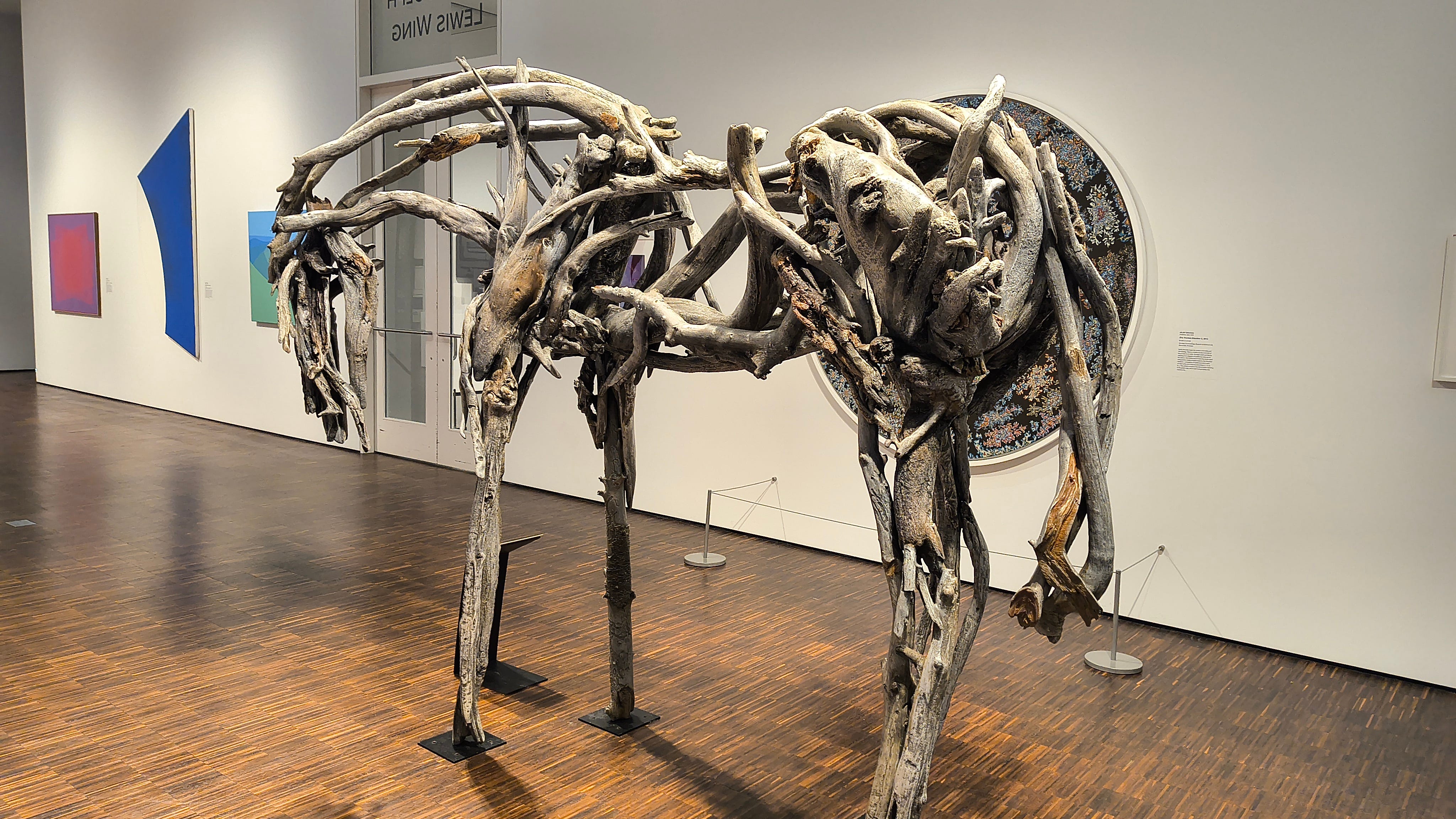
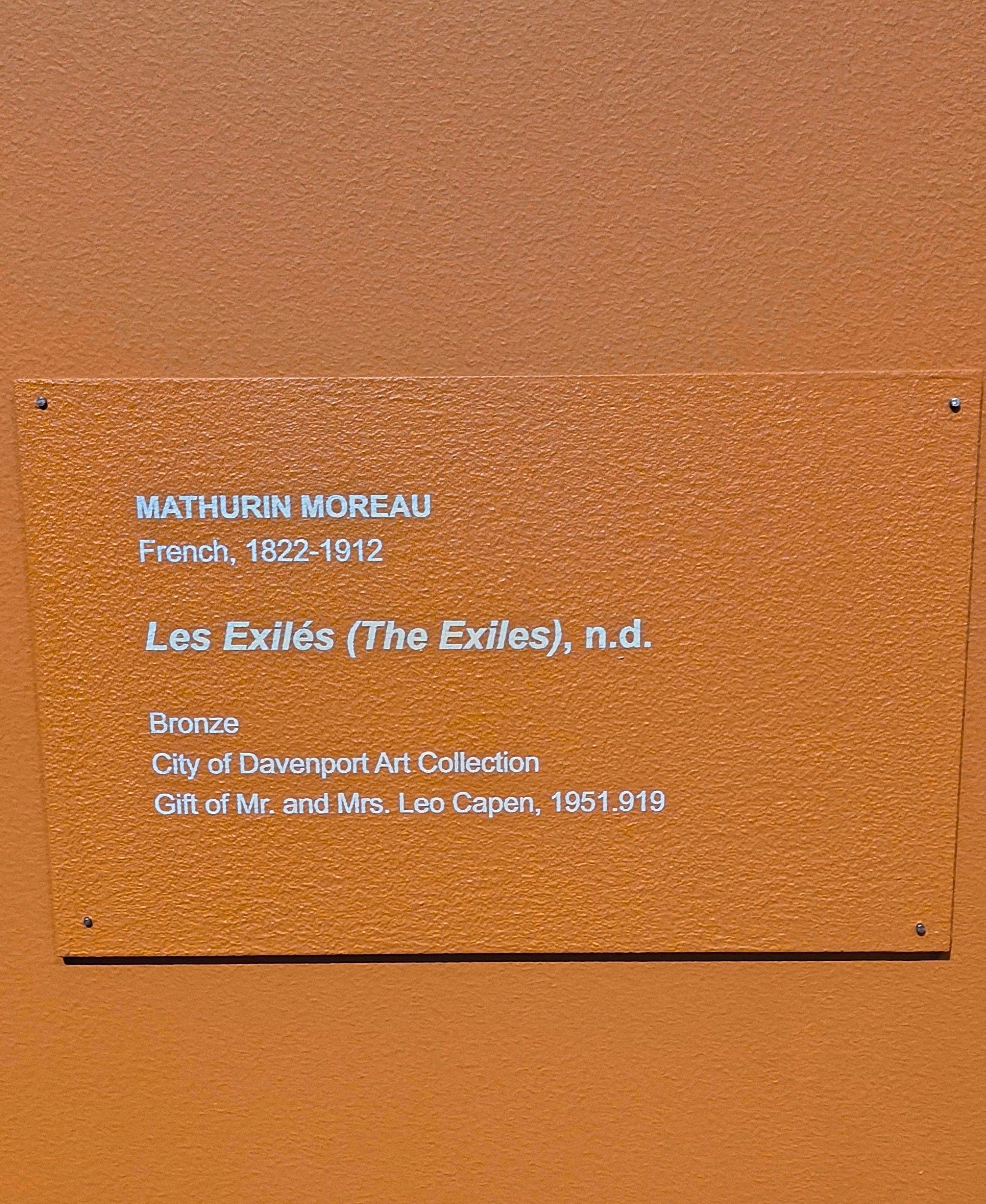
Sometimes, when looking at an object, such as large sculpture in the middle of the room, finding the label can be tricky. Below I have a few more examples from our museum.
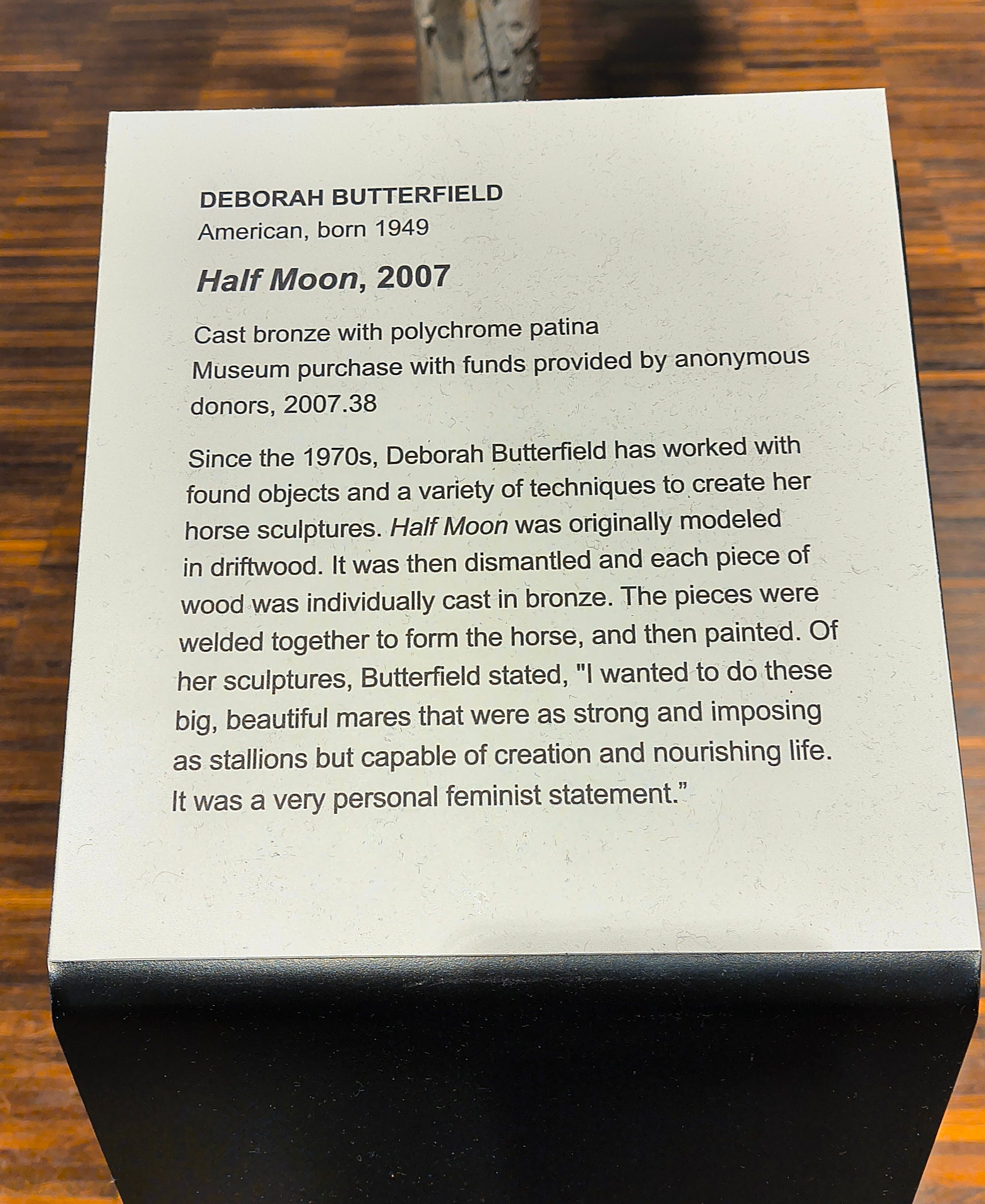
In the case of the Deborah Butterfield horse, luckily the label is free-standing right next to it so a visitor can just look directly down.
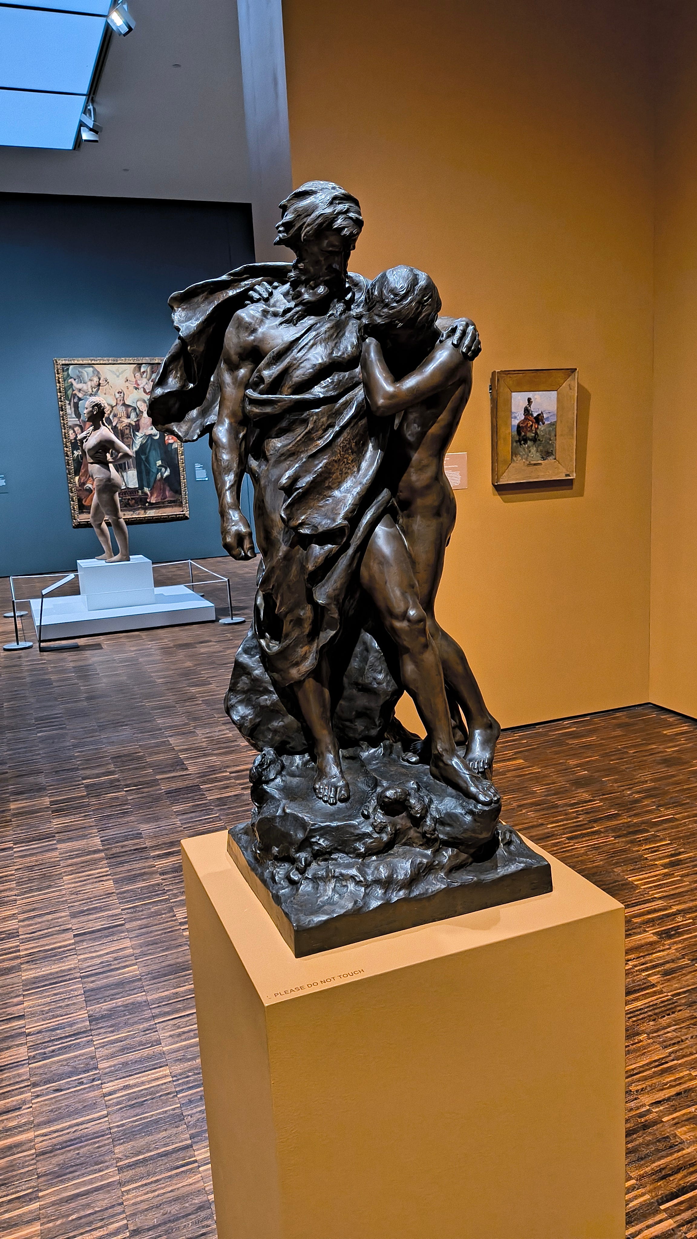
However, in the case of this classic bronze sculpture, it’s obvious the label is not anywhere on the stand. In most museums, the label for floor pieces goes against the wall, so you might have to look around a bit. Why not just put it on the floor?
The reason for this is simple: we do not want visitors to get super close to the art or bump into it. Additionally, the labels should be at a comfortable height where everyone can read them, and the museum must follow ADA (American’s with Disabilities Act) regulations so visitors who need wheelchairs or other mobility aids can read our labels.
The floor would be way too low.
So what do you think?
Now that you have seen a bit more about the work that goes into creating these lovely labels, would you take extra time to stop and read?
I’d love to know your thoughts below.
❤❤ K.A. Vandercoy